Tables & Other Charts — Data Visualization Part 2

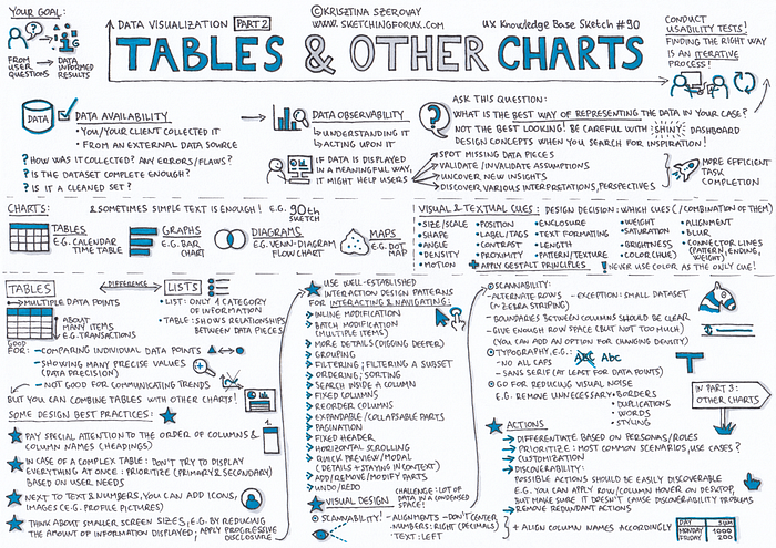
Data Availability vs. Data Observability
It’s a good starting point to have data (data availability), but the question is: can you or your user act upon it in a meaningful way (data observability)?
The main goal of designing data visualizations is translating user needs and questions to data informed results.
This sketch lists out the most important chart types and visual & textual cues; and contains some best practices for designing tables.
Related sketches

If you like my sketches, you can buy me a coffee to support my work! Thanks, I really appreciate your encouragement! 🙏
Recommended Reading & Useful Links
Few, S. (2012.) Show Me the Numbers: Designing Tables and Graphs to Enlighten
Knaflic, C. N. (2015.) Storytelling With Data: A Data Visualization Guide for Business Professionals
Miriah Meyer, M., Fisher, D. (2018) Making Sense of Data: Designing Effective Visualizations
Few, S. (2016). Information Dashboard Design: The Effective Visual Communication of Data
Clap 👏 — please show if you like this sketch, so others can find it more easily!
Respond 💬 — please let me know in the response section if you have any suggestions or questions!
Thanks for being interested in my UX Knowledge Base Sketches! 🙏
If you are interested in sketching, check out my Sketching for UX designers course.
Please feel free to join the Sketching for UX Designers group on Facebook, post your UX sketches, share your favorite links, ask questions etc.
You can subscribe to my Sketching for UX newsletter to get these UX Knowledge Base Sketches directly to your inbox weekly, and to participate in a 100-day long UX-visual library building challenge. If you subscribe, you can also download the Sketching for UX designers WORKBOOK for free!
If you have any comments or questions please reach out to me here or on Twitter:@krisztaszerovay

